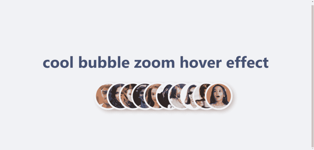
Incorporating interactive elements into a website can significantly enhance the user experience. One such engaging effect is the bubble zoom hover effect, which adds a dynamic visual appeal to image galleries or profile sections. This tutorial will guide you through creating a cool bubble zoom hover effect using only HTML and CSS. By the end of this project, you will have a responsive, visually appealing image hover effect that smoothly enlarges images when hovered over, providing a modern and polished touch to your web design.
The objective of image bubble zoom
The objective of this project is to demonstrate how to create an image bubble zoom hover effect using HTML and CSS. This effect will allow images to scale up and stand out when hovered over, creating an interactive and engaging experience for users. The tutorial aims to help you understand the use of CSS properties like grid, transition, and scale, along with pseudo-classes to achieve a responsive and visually captivating design without the need for JavaScript.
Features
- Interactive Hover Effect: When an avatar is hovered over, it smoothly scales up, creating a zoom-in effect.
- Responsive Design: The layout adjusts based on the number of avatars and screen size, ensuring consistent presentation across devices.
- Grid Layout: Utilizes CSS Grid to organize and display avatar images in a structured grid format.
- Customizable Variables: CSS custom properties (
--avatar-size,--avatar-count,--column-size) allow for easy customization of avatar size and layout.
Source Code & Live Demo
To use this project source code effectively:
- Source Code: You can obtain the complete source code by copying the code provided below.
- Download: You can download the source code by clicking the Source Code button below to get a ZIP file of the project. Extract the contents to your desired directory.
- Open the Project: Open the project folder using a text editor or an integrated development environment (IDE) like Visual Studio Code.
- Modify and Experiment: Customize the content, styles, and functionalities to suit your preferences. Experiment with different design elements to enhance your learning.
<!DOCTYPE html>
<html lang="en">
  <head>
    <meta charset="UTF-8" />
    <meta name="viewport" content="width=device-width, initial-scale=1.0" />
    <title>cool bubble zoom effect</title>
    <link rel="stylesheet" href="style.css" />
  </head>
  <body>
    <h1>cool bubble zoom hover effect</h1>
    <div class="avatars">
      <img class="avatar" src="https://i.pravatar.cc/200?img=14" alt="" />
      <img class="avatar" src="https://i.pravatar.cc/200?img=47" alt="" />
      <img class="avatar" src="https://i.pravatar.cc/200?img=21" alt="" />
      <img class="avatar" src="https://i.pravatar.cc/200?img=12" alt="" />
      <img class="avatar" src="https://i.pravatar.cc/200?img=36" alt="" />
      <img class="avatar" src="https://i.pravatar.cc/200?img=55" alt="" />
      <img class="avatar" src="https://i.pravatar.cc/200?img=31" alt="" />
      <img class="avatar" src="https://i.pravatar.cc/200?img=15" alt="" />
      <img class="avatar" src="https://i.pravatar.cc/200?img=24" alt="" />
      <img class="avatar" src="https://i.pravatar.cc/200?img=37" alt="" />
    </div>
  </body>
</html>
html {
  font-family: system-ui, sans-serif;
  font-size: 1.5rem;
  color: hsl(220 40% 35%);
  height: 100%;
}

body {
  background-color: hsl(220 20% 95%);
  display: flex;
  justify-content: center;
  align-items: center;
  flex-direction: column;
  height: 100vh;
}

.avatars {
  --avatar-count: 10;
  --avatar-size: 75px;

  --column-size: calc(var(--avatar-size) / 2);

  display: grid;
  grid-template-columns: repeat(var(--avatar-count), var(--column-size));
  transition: 500ms;
  transition-delay: 500ms;
}

.avatars:hover {
  --column-size: calc(var(--avatar-size) * 1.5);
  transition-delay: 0ms;
}

.avatar {
  width: var(--avatar-size);
  border-radius: 100vw;
  border: 5px solid #ffffff;
  box-shadow: 0.25rem 0.25rem 0.5rem hsl(0 0% 0% / 0.2);

  transition: scale 500ms;
}

.avatar:hover {
  scale: 2;
  z-index: 2;
}

@supports selector(:has(+ *)) {
  .avatar:hover + .avatar,
  .avatar:has(+ .avatar:hover) {
    scale: 1.5;
  }
}
Code & Preview
See the Pen Image Bubble Zoom by Mamun Hossain (@Mamun-Hossain-the-bold) on CodePen.
You can download the source code files for free by clicking the Source Code button. Additionally, you can edit and view a live demo by clicking the Code & Preview button below.


