Creating 3D effects in web design has become increasingly popular, especially when used for interactive UI elements. One fascinating example is the “3D Water Cup” effect using CSS. This effect not only demonstrates CSS’s potential for creating realistic 3D visuals but also adds a dynamic layer to user interfaces, especially for websites related to food, beverages, and drinks. In this article, we’ll explore the “3D Water Cup” CSS effect, providing 15+ live examples of this effect in action. These examples will showcase the power of HTML, CSS, SCSS, and JavaScript, giving you insights on how to implement, customize, and optimize the effect for various browsers.
Objective Of 3D Water Cup
Our goal is to provide a comprehensive guide for creating and using 3D Water Cup CSS effects. This article will include live examples with detailed information such as the technology used, browser compatibility, and practical use cases. Through this guide, you will gain a deeper understanding of the capabilities of CSS for creating immersive and engaging 3D Water Cup web elements.
the example list of 3D water cup
Here’s a curated collection of 15+ stunning 3D Water Cup CSS examples. Each example showcases creative designs and animations that demonstrate the potential of CSS and JavaScript in web development. These examples are interactive, and responsive, and come with details like the technology used, browser compatibility, and functionality. You can explore live previews for better understanding and inspiration.
Stylish 3D Tea Cup with Vapor Animation in CSS
This example showcases a creative 3D teacup design with an animated vapor effect using HTML and CSS. The teacup features realistic details, including a gradient-filled handle, tea surface, and plate shadow, giving it a lifelike appearance. The vapor effect adds a unique animation touch, simulating steam rising naturally from the cup. Ideal for visually appealing web projects, this design highlights the power of pure CSS for creating engaging graphics and animations.
3D Coffee Cup Animation with Steam Effect Using CSS
This example creates a stunning 3D coffee cup with a realistic steam animation effect using HTML and CSS. The cup features smooth gradients, a rounded handle, and a detailed plate shadow that enhances its depth and dimension. The animated steam rises naturally from the coffee, giving a visually appealing and dynamic effect. This design demonstrates how CSS can be used to bring creative ideas to life, making it perfect for interactive and stylish web components.
Rotating 3D Water Cup Animation Effect Using CSS
This example features a unique rotating water animation using pure CSS. The water container utilizes a polygon clip-path for a distinct shape, while two animated overlays rotate continuously to simulate flowing water. The design incorporates soft shadows and a smooth motion effect, creating a visually appealing result. This animation is perfect for web elements that require creative liquid or water effects.
Hover Animation Coffee Cup Effect with CSS
This example showcases a creative coffee cup effect with a smooth hover animation. The cup features a repeating coffee image that shifts its background position, giving the impression of flowing coffee when hovered. Using pure CSS animations and keyframes, this design provides an interactive and visually appealing experience for users.
Animated 3D Water Cup with CSS Keyframes
This example demonstrates a visually engaging animated cup with a liquid effect using pure CSS. The design utilizes CSS keyframes to create a rotating liquid animation within the cup, adding a smooth and realistic motion. By combining gradients, shadows, and transitions, the cup animation stands out with an appealing aesthetic.
CSS3 Animated Cup with Bubbles
This example demonstrates a CSS3 animation that simulates a cup filled with bubbles. The cup has a gradient effect, and the bubbles grow and shrink in an animated loop, creating a fun and dynamic visual effect. The code uses various CSS properties, including keyframes for animation, to bring this interactive design to life. The bubbles and the cup animation work together to create a smooth and engaging user experience.
Animated Water Glass Loader
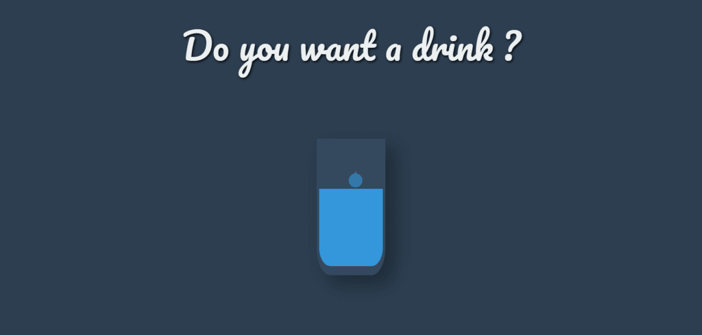
This unique animated loader simulates a water droplet falling into a glass, creating a fun and engaging visual effect. The animation is designed using CSS keyframes and features a water droplet falling repeatedly, filling a glass. The effect is both visually appealing and lightweight, making it ideal for websites that need a creative loading screen or interactive element.
Animated Wine Glass with Drip Effect
This animation features a creative representation of a wine glass with a droplet effect. The droplet falls repeatedly into the glass, and the “bulge” effect simulates the wine level rising. The glass is dynamically styled, with a rotating shape and an animated drip that adds an interactive feel. This CSS-based animation is ideal for beverage-related websites or as a fun animation for loading screens.
CSS Coffee Cup with Steam Animation
This animation showcases a stylized coffee cup with steam rising from it, using CSS keyframes for dynamic effects. The cup has multiple parts, including the body, top, and bottom, while animated steam elements give the effect of hot steam escaping the cup. The use of Sass variables and mixins enhances the maintainability and organization of the styling.
CSS Cup with Stick and Bottom Animation
This CSS animation creates a simple yet stylized cup with a stick and a bottom element, giving a unique geometric and colorful design. The cup is drawn using clip-path for creating smooth curves, while the stick and bottom are styled with gradients and rotations to provide an eye-catching, dynamic effect. The use of absolute positioning and pseudo-elements ensures precise placement for each part of the design.
CSS Animated Tea Cup with Smoke Effect
This code creates a visually appealing tea cup with a smoke effect, making it look dynamic and realistic. The cup is styled with gradients and shadows, and the tea bag is animated with a floating motion. The smoke effect adds an extra touch, making it look as though steam is rising from the cup. This design showcases the power of CSS for creating complex animations and smooth visual effects without JavaScript.
CSS Coffee Loader Animation
This code creates a responsive coffee cup loader with a fluid animation effect. The loader simulates coffee pouring into a cup, gradually filling it from the top to the bottom. It is designed to be scalable, adjusting its size based on the viewport width, making it suitable for various screen sizes. The animation is smooth and continuous, giving a realistic pouring effect using pure CSS with minimal markup.
Hover-Activated Animated Cup Icon with Steam and Dot Effects
This example demonstrates an animated SVG cup icon that activates on hover, creating a fun visual effect with steam lines and animated dots emerging from the cup. The effect is achieved using CSS animations and the :hover state, allowing for a smooth, engaging experience when the user interacts with the icon. The steam lines rise, and the dots appear in a pattern, mimicking a hot cup of liquid with a dynamic steam flow.
A Playful SVG Mug with an Owl Design
This example showcases a delightful and whimsical design featuring an SVG of an owl-inspired mug. Using HTML and CSS, the mug is structured with a combination of elements such as paths, ellipses, and gradients to create a visually appealing and fun design. The layout is responsive and designed with care to fit various screen sizes. The mug’s cup, ears, wings, and eyes add character, and the SVG provides a clear, crisp illustration. This is a perfect example of combining creativity with code to build unique and playful web elements.
Animated Cup Filling Effect
This example demonstrates a unique animated filling effect in a cup using HTML and CSS. The cup is created with the div element and styled using CSS to simulate the effect of liquid filling the cup. The animation is achieved through the use of @keyframes a repeating background image. The box-shadow and border-radius properties give the cup a 3D effect, enhancing its realism.
Animated Liquid Bowl with Shadow Effect
This example showcases a dynamic animation of a liquid-filled bowl with interactive rotation and shadow effects. The bowl itself rotates smoothly in both directions, while the liquid inside sways with a subtle animated rotation. The background color changes over time, enhancing the visual appeal. The use of CSS @keyframes and transform-origin makes this animation fluid and engaging. The bowl’s shadow also shifts, creating a realistic depth effect, and adding more life to the animation.
Lemon-Infused Glass with Water Animation
This design showcases a glass filled with water, topped with a detailed lemon graphic, bringing the illusion of a refreshing drink. The water is dynamically styled with soft shadows, giving it a lifelike depth. The lemon is creatively designed with segmented details and animated with shadows to add realism. The glass itself has a semi-transparent backdrop, creating a sophisticated and clean look that can be used for beverage-related UI or visual designs.
Conclusion
The 3D Water Cup CSS effect is a visually captivating way to enhance your web design, creating realistic animations without heavy reliance on external graphics. By using a combination of HTML, CSS, SCSS, and JavaScript, developers can create interactive, dynamic user interfaces that engage visitors and enhance the overall user experience. The examples shared in this article, along with customization tips and browser support information, provide a valuable toolkit for designers and developers looking to incorporate this effect into their projects. Whether used for loading screens, product displays, or creative demos, the 3D water cup effect is a versatile and impressive way to elevate your website design.


